Mega Ice Cream
Categories
Brand Strategy, Packaging, Design Identity
Client
Nestle
Project
Mega
Services
FMCG
Year
2024
A Mature Brand
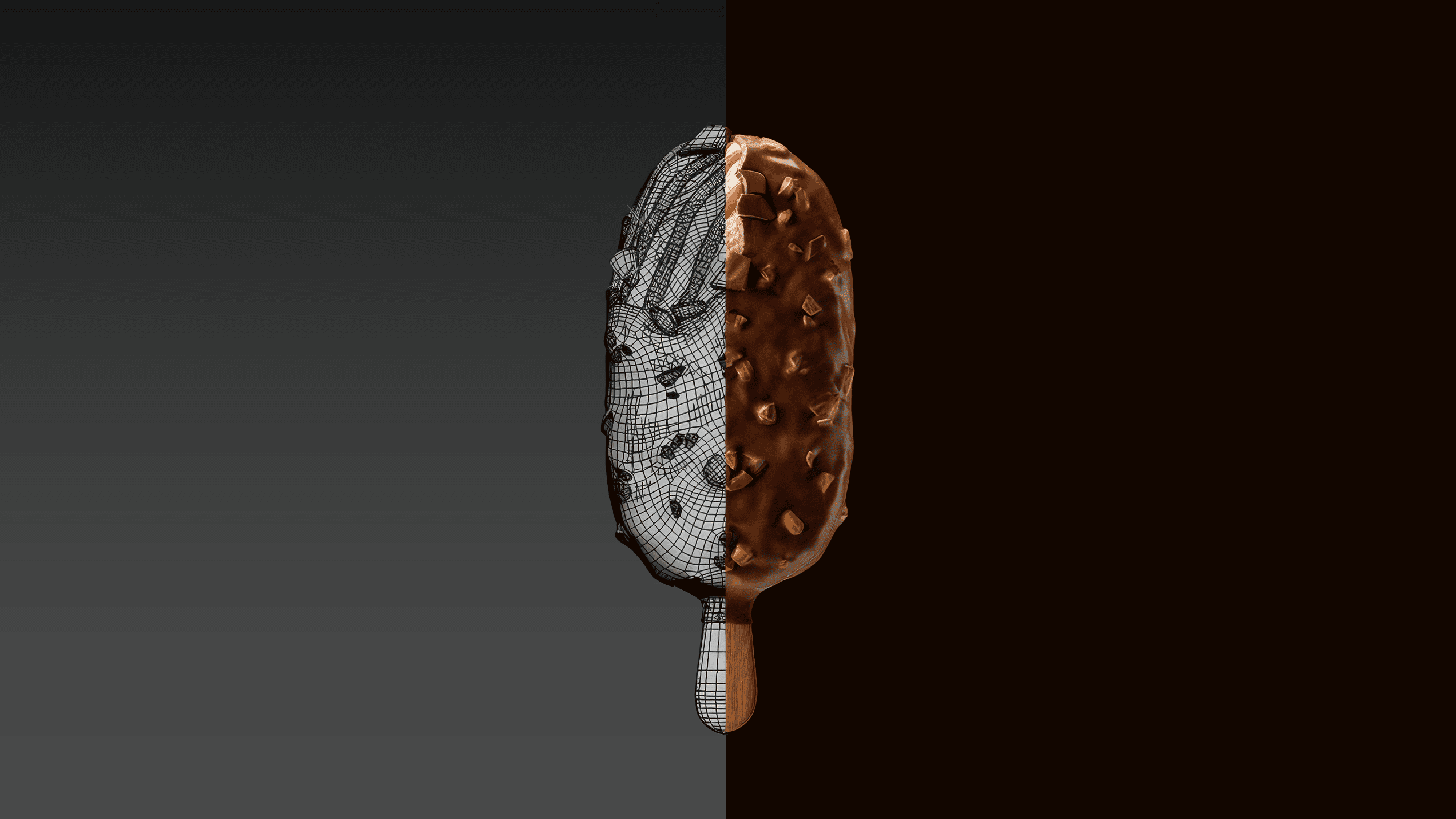
Over the years, Mega has grown into Nestlé’s leading ice cream brand, one that embodies indulgence, craftsmanship, and sophistication in every detail. The rebrand aimed to elevate that maturity through a more confident and premium identity, one that reflects the quality of the product while allowing the brand to comfortably own its place in the market.
The new visual language was designed to balance richness with clarity, creating a system that feels timeless, distinctive, and globally unified. Every element was carefully considered to reinforce Mega’s positioning as an indulgent experience rather than simply an ice cream product.
A Mature Brand
Over the years, Mega has grown into Nestlé’s leading ice cream brand, one that embodies indulgence, craftsmanship, and sophistication in every detail. The rebrand aimed to elevate that maturity through a more confident and premium identity, one that reflects the quality of the product while allowing the brand to comfortably own its place in the market.
The new visual language was designed to balance richness with clarity, creating a system that feels timeless, distinctive, and globally unified. Every element was carefully considered to reinforce Mega’s positioning as an indulgent experience rather than simply an ice cream product.


The Iconic “M”
At the heart of the rebrand is the iconic “M”, a symbol created using the negative space of an ice cream stick to form a bold and confident initial. The mark was designed to instantly communicate elegance, craftsmanship, and memorability while becoming a recognizable asset across all brand touchpoints.
To complement the icon, we developed a custom wordmark with refined proportions and a luxurious presence. The golden typography, paired with rich product visuals and highly detailed packaging compositions, amplifies the sense of indulgence and transforms the packaging into a more immersive and premium brand experience.
The Iconic “M”
At the heart of the rebrand is the iconic “M”, a symbol created using the negative space of an ice cream stick to form a bold and confident initial. The mark was designed to instantly communicate elegance, craftsmanship, and memorability while becoming a recognizable asset across all brand touchpoints.
To complement the icon, we developed a custom wordmark with refined proportions and a luxurious presence. The golden typography, paired with rich product visuals and highly detailed packaging compositions, amplifies the sense of indulgence and transforms the packaging into a more immersive and premium brand experience.